View Cart
Latitude 16 Organic Gin (L16) has been recognised in the 2026 Australian Good Design Awards, Australia’s longest-running international design awards, for excellence in design, innovation and impact.
In the last chapter, I talked about getting the label into production but before any of that could be photographed on a real shelf, in real light, we needed a way to see it first.
In the last chapter, we explored the label design — how reef light, restraint and material behaviour shaped the look of Latitude 16. This chapter is where that vision either holds… or falls apart.
Once the bottle and glass are defined, the next layer is where Latitude 16 becomes recognisable in an instant — the label.
Once the bottle form is defined, the next challenge is turning that idea into glass that can be produced consistently — while still delivering the quiet cues people notice instantly.
The Latitude 16 bottle was designed to reward attention. Not with loud features, but with details you notice in your hands — the way light catches, the way the surface moves, the way it sits with quiet confidence.
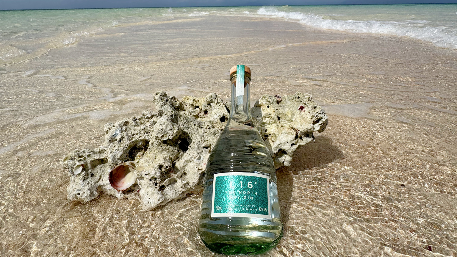
From Concept to Glass: Behind the Scenes of Latitude 16 is a look at how we carried that reef moment from memory into form — the bottle, the glass, the label, and the finishing details that shape the first impression.
This week, L16° was awarded Gold in the World Brand Design Society Awards for our gin branding.
Before there was a bottle, a label, or even a name, there was a moment that stayed with me — a feeling I couldn’t quite articulate.
Inspired by a secluded coral cay in the Great Barrier Reef and the pristine waters that surround it, L16 celebrates the point where two UNESCO World Heritage sites — the Reef and the Daintree Rainforest — meet.
Organic gin appeals to drinkers who value sustainability, transparency, and authenticity.
For many, choosing organic spirits isn’t just about flavour — it’s about aligning purchases with personal values.
No products in the cart.